Showing posts with label Advertisments. Show all posts

Saturday, 21 August 2010

Scarlett Johansson for MANGO- the adverts.


Have you guys seen the new Mango AW10 ad campaign, featuring, again, the natural beauty that is Scarlett Johansson?

I don't really buy Mango clothing, mainly because we don't have a store near by, but when I visit a city and I see a store I go in to check out all the lovely accessories and timeless fashion pieces. I like the companies advertisig campaigns too- specifically when Penelope Cruz became the face of the brand, and I do like Scarlett in the new campaign but I just feel the picture editors have taken away some of Scarlett's universal look. She is known to be quite curvacious and in my opinion she opposes 'the celebrity' look.

The ad campaign was shot by photographer Mario Sorrenti in Los Angeles: the stylist, Camilla Nickerson, make-up artist Stéphane Marais and hair stylist Oribe, completed the team for the shoot. Each artist here is amazing at what they do, the picture editors really don't need to photoshop the image to the extent they seem to have done for this campaign.

What do you guys think about the campaign?

Wednesday, 11 August 2010

Fall A/W Adverts

So the september issues are all showing their lovely covers on every newstand around, I've bought a good few so far and I'm just loving fall A/W adverts.

This season is by far my favourite in terms of clothing, accessories, colours and yummy boots. I'm a winter girl at heart, there's nothing like layered clothing, vintage chunky knit scarves, black everything and coming home to a warm house when your freezing on your commute.

The adverts for fall I prefer: I love the mix of textures in the clothing, it makes the image much more exciting, the products themselves are amazing- huge handbags in black, tan and grey wash oh my...

Here's a few of my favourites.


Friday, 21 May 2010

The Untold Stories

Anyone else absolutely loving the new Fred Perry campaign colour scheme in their advertising?! Beautiful..

Mod 1959


I love the graphic design layout of this footwear image

Footwear 1957

Wednesday, 14 April 2010

'Avant toi'


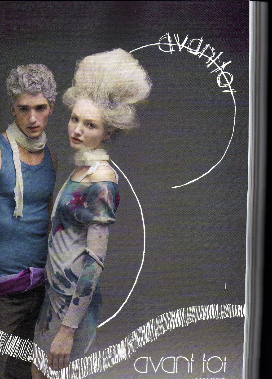
I was flicking through some magazines the other day thinking about ideas for our photoshoot whether that be with styling, make up, hair, anything really just something to inspire and I came across the advert ‘avant toi’ a company promoting cashmere products and the female model especially in the advert had an interesting look.

Her hair was white and resembled a nest which looked quite cool and her pale skin and fair eyebrows and hair added an almost unnatural natural look. This is something we should think about in terms of make up for our photo shoot.

Wednesday, 10 March 2010

Advertisements


(p.s sorry about the squeiff images :S)

An initial idea that I am having for the photography project is to look at advertisements as fashion photographs and maybe having our shoot in a similar style to fashion adverts. I picked up a brilliant book to reference this and influence this idea from the library the other day, 'Smoke signals, 100 years of tobacco advertising'. (it really links with what I have already been looking at for my ideas so far).

The nostalgia in the adverts is charming although considering the concept of the advertisements, selling cigarettes, one wouldn't think that this could be possible. For me personally it isn't the subject matter at all but the format of the advertisements that's attracting my attention. With this in mind, and when looking at the some of the advertisements, I can realise a huge shift in what some of the adverts are saying for the product, some heavily glamorise the product; showing images with aristocratic connotations and very glamorous women which are used to sell the idea, the product and the lifestyle, some are literally just an image of the product. The advertisements have a lot of text on the front of them, seemingly showing us that the image and the product alone, may not sell the product. The book is easy to navigate through as the years are categorised. The year that I'm preferring the most is the 1960's, 'The New Way' as it is referred to in the book. The main front image being of a western masculine man, smoking a cigarette, with his cowboy hat and battered leather waistcoat, his label is 'The Malboro Cowboy'. I might think about the idea of consumer consumption and advertising for this project???

I can see that the matchbox colour and connotations has led me on this tangent. Not too sure what the rest of the group will think, but we are meeting tomorrow to talk about our ideas, so we will see.